
A couple of people have expressed interest in my process of creating the photos I add to my first impressions and reviews. That came as quite a surprise as I still very much feel there is a lot I need to learn and improve. But I guess I figured out a few things along the way, and I’m happy to share those. I don’t really have time right now to shoot a lot of images for this, so I’ll try to show as much as I can directly with the images I used in my written pieces.
With that said, buckle up: this will be a long one …
Style
Photography is equal amounts art and craftsmanship. That means two things: 1) the quality of your photography has likely more to do with you than your gear and 2) what looks great is highly subjective. Take for example a look at some of the board game influencers on Instagram. There are those that shoot the box in front of the game (for instant recognition of the game, sort of the clickbait of boardgame instagram), those that do creative stuff with the board game components, those that post pictures primarily of themselves but also holding a board game, and so on. There are many different styles and things people want to achieve with them.
Probably a good point to start for you is to find a couple of people whose style you like and figure out what you yourself want to aim for. Getting a lot of followers? Be creative? Contributed to BGG? For me, I want people to see what’s it like to play a game, not marvel at how great the box cover looks or in which location I’m traveling. Ideally someone sees one of my pictures and says “oh, that looks interesting, what’s that?” instead of saying “Arc Nova, I know that, thumbs up”.
Since I primarily shoot pictures to illustrate points I make in my writing, my style is less about being artistic and more about being informative and evoking a certain feeling of being intrigued and discovering a new game. As such, it’s most similar to product photography, but less glossy. There are no smoke machines, fake backgrounds, or tons of props. I also need to make sure all the vital details are there (=so not everything heavily blurred out) but still the image to feel more like a game being played and not someone had taken a photo of some cardboard. So I’m aiming for a neutral, consistent, but recognisable look.
Location & Background
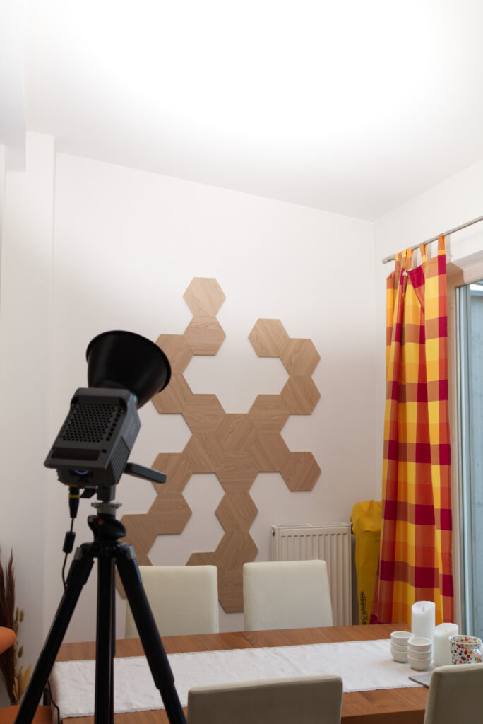
Let’s start with location as that’s probably the most recognisable part of my images. I shoot on the dining table in my living room. That implies a couple of important things: there’s a window and natural light comes in. Natural light can be great for photography, but in my case it’s a huge challenge because it’s so erratic. It might not be a problem for you. Let’s put a pin in it for now and talk about lighting later. There’s a table, there’s a wall directly behind the table, and there is stuff all around. Let’s work with that.
Here is a shot of GMT’s Mr. President which was so huge I actually had to get out the table extension and go further back to fit everything into view. Looks quite nice, right? First thing a lot of photographers do is check out what light sources were used. We can see the frame of the window on the right is lit from both sides, so I must have shot it during the day. However, the cup in the lower left corner also throws a shadow towards the window, so I must have set up a light that’s stronger than daylight somewhere off to the left and pointed it at the table.
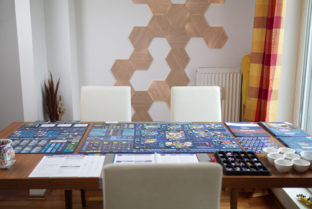
The table has a nice wooden surface, chairs look stylish and are a good contrast to the table itself, the lighting panels on the wall, some plant thing in the centre-left, piece of lego sneaking in in the lower-right, colourful curtain. There is also a consistent colour scheme: most of the surroundings is either white (walls, radiator, stools) or brown (table, hardwood floor, plant, LED wall panels). That helps to not detract too much from the game itself.
There are a couple of things that aren’t ideal: the column on the left and the shadow it throws (though it helps break up the background a bit), the ugly radiator (but I can’t do anything about that), the Disc Golf bag in the right behind the curtains (I could move it away but usually I don’t bother).
It’s even more interesting what you don’t see. Next to the column on the left I typically keep my folding bike and on the wall there’s an Irish drum hanging, but I put them away for the shot. Normally there would be two chairs on the front side of the table instead of just one (this is a solo game). There is a power plug and some charging cables on the ground near where the curtains are, which I hid under the curtains. Which leads me to my first tip:
Tip 1: Where do you want to shoot and what do you NOT want to have in frame? Most people have too much stuff in their apartment. Take a shot and check what’s bothering you in the image. Could be a half-empty tea cup, the texture of a surface, a small piece of paper you didn’t notice before. Just move things off camera a bit and the whole image will look nicer.
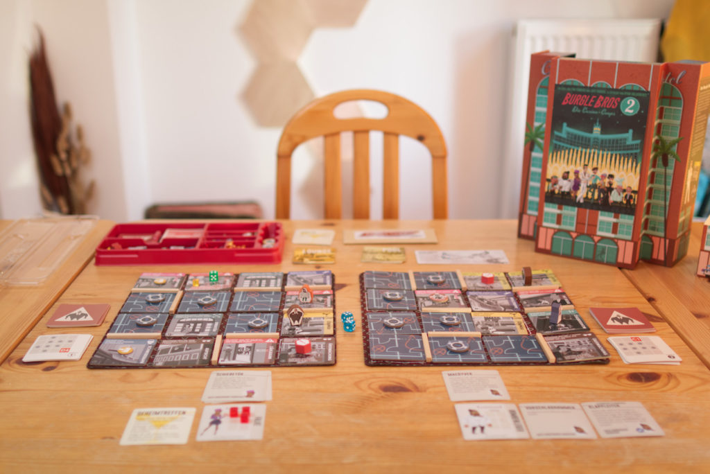
That part of my apartment also didn’t look that way before I started shooting photos there. The table was a busted up one I still had from my time at university. It was smaller and with only two wooden chairs instead of four with upholstery, the plant-thingy wasn’t there, same for the light panels on the wall. I couldn’t find an old enough image but here is one from my Burgle Bros 2 review which was before I switched tables. The table is just 80x80cm without the side-extensions and the surface was completely banged up. It also gave everything a nasty orange tint.
The table was originally oriented in parallel to the window (so rotated 90 degrees) which was a problem because I had to either shoot against the huge window (and the sunlight would have blown out everything or at night there would have been a giant dark square) or squeeze between the table and window and shoot in the opposite direction where you could see half my living room. There’s way too much distracting stuff there, so I simply rotated the table.
Regarding the table and chairs: I picked them up for cheap on the German equivalent of Craigslist. You would be surprised for how little money you can get really nice designer furniture – if you have time. Sooner or later, someone else needs to move cities in a hurry and is happy if you take some bulky furniture off their hands. But I didn’t do it just for taking phots. I needed to get a replacement table anyway and this was a good opportunity to do so.
What works equally well but is much cheaper: get a table cloth. Doesn’t even have to be an expansive one. The following image of Castles of Mad King Ludwig shows the same busted up table but with a 20€ table cloth I got specifically because it had a nice neutral colour and some texture which is cool for shooting. It’s way less expansive than a neoprene mat and much easier to stow away. It worked so well I got a second, darker one so I could mix up the colours from time to time.
Tip 2: You can create yourself a nice background for cheap. Get a decent table cloth or two and you have a great surface for shooting. And while you’re in the furniture store, why not pick up a small lamp, vase or something else for the background?
That plant thing on the left and its vase I got in the same store. It’s some dried out twigs that I just thought fitted the colour schema and looked interesting. The Nanoleaf lighting panels on the back wall I got because that wall had been blank for years and I hated it. Now that I wanted to shoot photos in this direction, it became even more obvious. Simple solution would have been to hang a picture but I kind of liked the idea of having light sources in the background. Not everyone has a blank wall to hang something on. But you might want to experiment with moving cupboards to slightly different places, reducing the amount of stuff you have in shelves, etc. Just take a picture and seen what bothers you in the image.
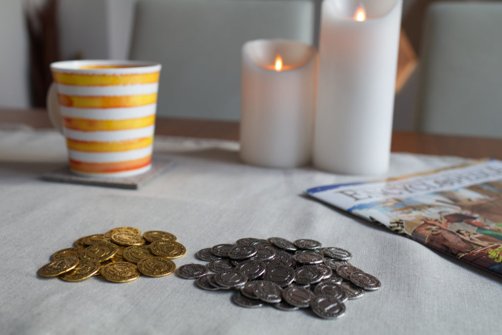
It’s also nice to have some optional stuff for the foreground if you don’t overdo it. Just showing a blank table surface with a few components can quickly look boring. I had been gifted some small-ish porcelain bowls (they are supposed to be used for dips) a couple of years ago and they turned out to work nicely for photos because they have a neutral colour. So I kept looking for the same model and found someone selling a set used, and now I have six. I like them for component shots like this one of Barcelona.
Other stuff that works for me: LED candles, glasses of wine, a pen, tea cups. Basically anything that would be on the table naturally and doesn’t have labels with text on them that would draw too much attention. Putting the game box or rulebook somewhere off centre can work too, but usually those don’t blend well enough into the background unless you turn put he camera blur (see later).
Tip 3: Add inconspicuous things to the foreground and background. Whatever it is, it should feel like it belongs there and not draw too much attention. Also don’t add too many new colours to the background. You want things to blend in.
Composition: Arranging & Framing
The stage is set, so it’s time for the game itself. What I usually do is setup the game, play it solo, and at various points take pictures to take the viewer along the journey. What’s it like to unbox the game? How much setup is needed? What does it look like at the end? For example, the Kickstarter edition of Carnegie has its custom trays as one of the biggest reason to buy it instead of retail. So I added a shot of it for the review. It also provides a clue of how much content is in this box.

What also works well is taking pictures during normal play sessions with my playgroups. I take a quick snapshot with my iPhone of the whole table when something interesting happens (e.g. a big battle, someone has a lot of resources). On a later day when I do the proper pictures, I use those images as a reference to reconstruct the situation and then take the proper pictures as well as close-ups.
Tip 4: Use real gaming situations. Either take reference shots during regular gaming sessions or play solo. You’ll know what an interesting or good looking situation is when you see it. And make sure to keep things neat: that tile might in reality only be a millimetre off and slightly at an angle. But in a picture, everyone will notice.
Once you have everything in place, just use your camera’s view finder and walk around. This is the fun part. Go very close, go far away, try things. Usually straight shots like directly from above the table look very boring because there isn’t enough dimensionality in them. Also it’s not how we look at games. Most images I take between where eye level would be if someone would be sitting and the table’s surface. It also works best if you don’t just see the table surface but a little bit of the surrounding as well, as for example here for the Rolling Heights first impressions.
Bonus advise: always keep your camera level and only tilt forward/backward. There is a reason why a lot of cameras have a levelling indicator build in. Dutch angles may seem like a cool idea when you shoot them, but believe me, they later look weird and detract from the game.
Tip 5: If you have found a good motive and perspective, check for dead zones where there is nothing happening. If they bother you, put something there to fill the space.
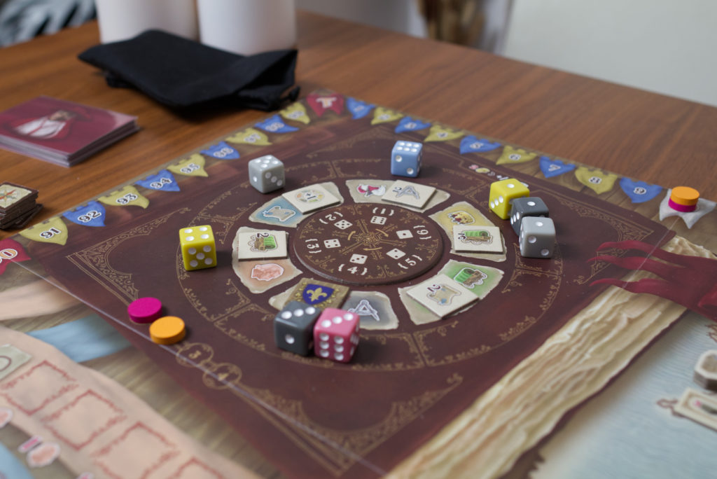
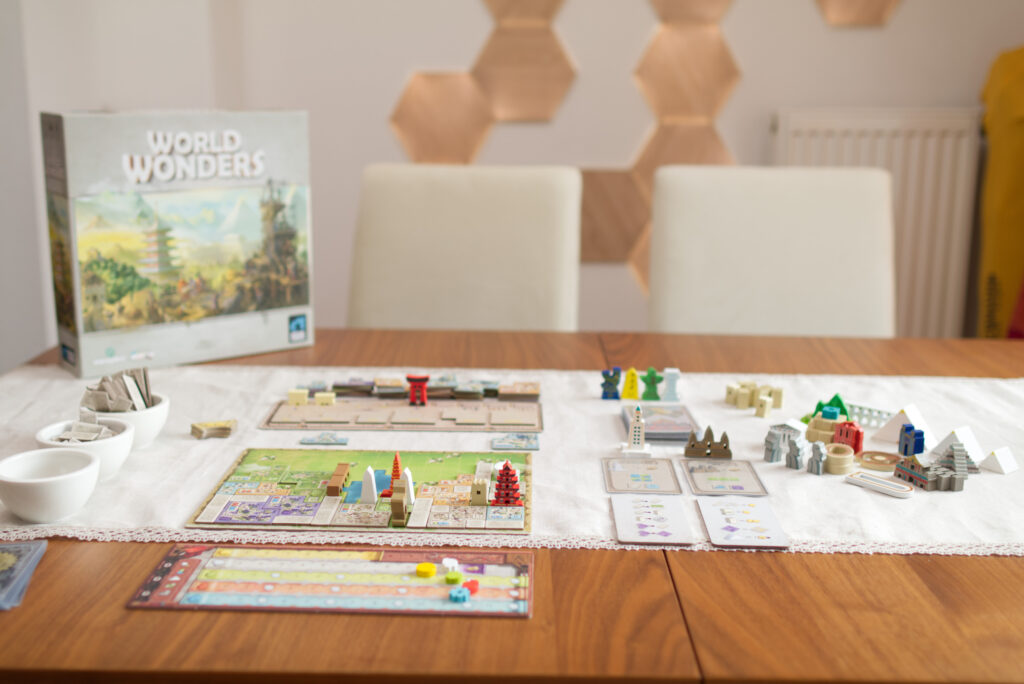
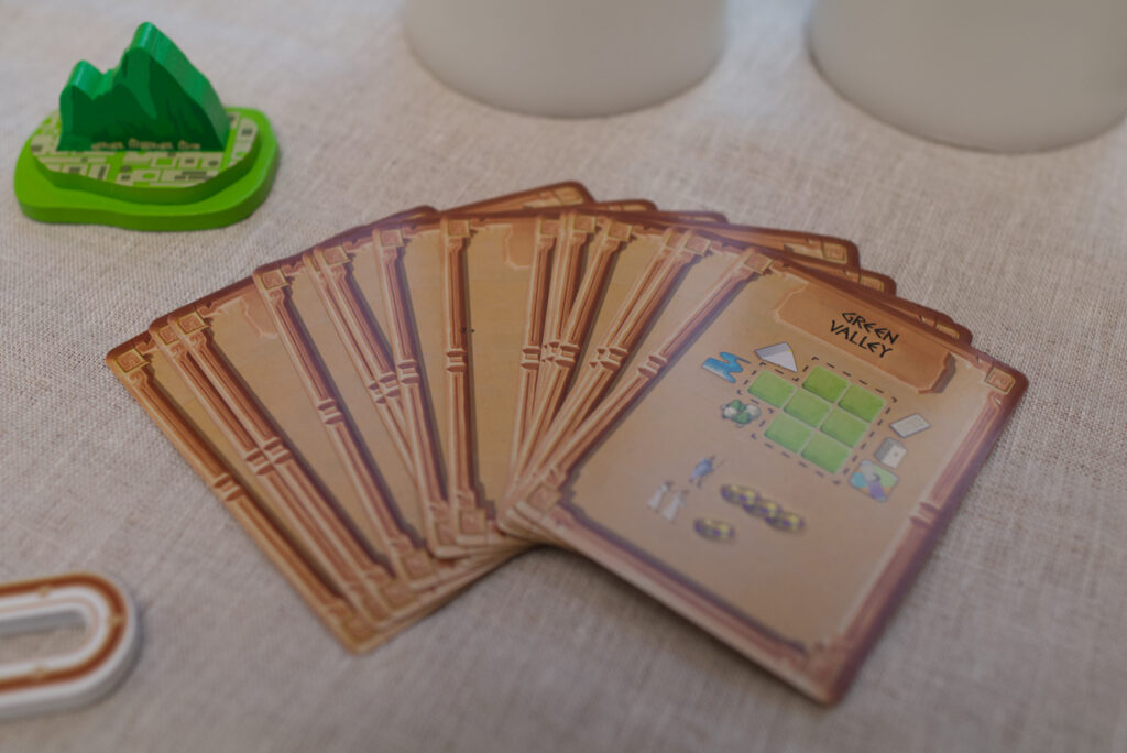
As an example, see the following image. Just having the cards on the table would have been boring so I intentionally placed them in front of the two candles (which you see too little of here for it to really work). Then there was still a giant gap in the top left and somewhat at the bottom corners. So for this shot of World Wonders I placed Machu Pichu at the top left which also gave a nice pop of colour. I intentionally left the bottom-right corner empty to not overdo it
Lighting & Shadows
One of the challenges I’m facing is that I typically need about ten pictures that all look consistent: a “full table shot” I use for the introduction and as thumbnail, one for the setup, special components, situations in the middle the game, etc. My giant window is actually a problem for that as the lighting conditions change and pictures will look inconsistent or under-/overexposed. So I usually avoid shooting during the day and rather shoot when the sun is down. If that’s not an option, I try to work very, very quickly.
Lighting is a giant topic and there are various approaches. It’s also THE primary factor for getting good looking images. To cut things short: forget about the ceiling lights you currently have. They a) will have a weird colour cast and b) will throw unpleasing shadows. Same for very cheap LED photo lights from Amazon. What we want is something that looks like daylight but is reproducibly always the same. You don’t want to have to figure out white balance and light intensities every time you set up for a quick shoot. For that, you need a good light source and a good modifier. If you’re on a budget, use daylight or some electrical light sources that indirectly light the room.
Here’s an old image from my Concordia Solitaria review before I purchased my first studio light. The shadows on the component sides and the porcelain bowl are too dark, everything has weird color tint (which I already reduced during editing), and the background is very dark (see top-right corner):
Currently, I’m using a “quick and dirty” setup because I don’t want to spend too much time setting everything up and having to tear it down again. After all, I’m a writer, not a photographer. So I use an Aputure Amaran 100d with the cone attachment that was included in the box, turn it to 90% (no real reason, could also put it at 100%), and just fire it directly into my ceiling! I tilt the angle so the shadows of the game components look okay and that’s pretty much it.
Tip 6: Invest in one decent light like the Aputure 100d and point it into the ceiling. That way you don’t need to buy a soft box or other light modifiers but still have nice soft shadows. If a new light is not within your budget, use day light or at least some light that indirectly lights your room. Don’t use your ceiling lights.
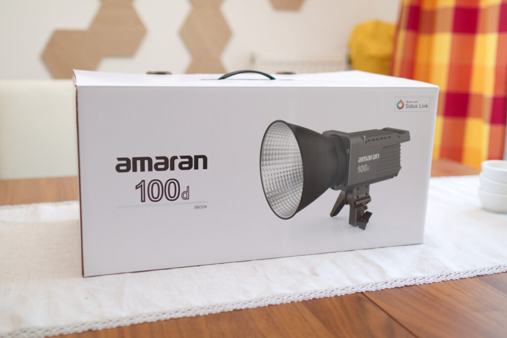
Side note on prosumer lights: The 100d is calibrated to somewhere around 5600 Kelvin which is in the colour temperature range of normal daylight, so it will be easy to get a correct white balance in camera (more on that later). The 100d is one of the least powerful lights in Aputure’s line-up and therefore a) rather affordable and b) doesn’t get blazingly hot. If you’re planning to shoot in daylight, you need something that can compete with sunlight and I would consider a 200d as the absolute minimum for that. Professional photographers would probably go even higher and use a 300d to have total control. There are also models like the 200x that can creating different colour temperatures (warm orange to harsh blue) but since I’m going for realism, I don’t need that. I started out with a 120d (which was the favourite light of many youtubers at the time) but it is unnecessarily heavy & expansive, the 100d is just fine, especially considering I’m only shooting at home and don’t need a heavy duty metal casings and carrying bags.
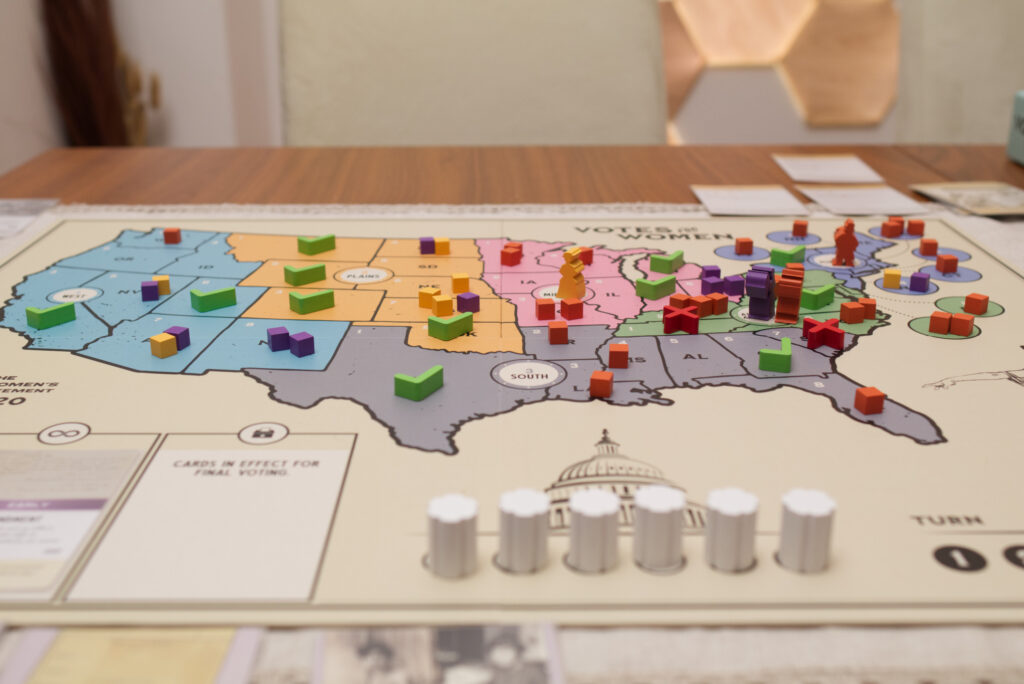
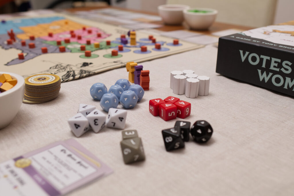
Let’s take a closer look at the lighting that “blasting the ceiling” creates: note in the image below of Votes for Women how the shadows are mainly “under” the components. The top side of the check marks is lit the most while the sides are darker. This produces a nicely contrasted look where the shape of the objects is easy to understand. Ideally the light would have come a bit more from the side though to give both sides slightly different intensities.
By changing the angle with which I blast the ceiling with light, I can change the direction of the shadows slightly, but in general it will retain this soft quality because the whole ceiling is the strongest light source that hits the board, not the Aputure 100d itself. I could have achieved a better result by setting up a second light and put it on a low intensity, just to fill in that side of the components unnoticeably. But I didn’t bother at the time as I wanted to get the review done quickly. If you want to get fancy with multi-light setups, start out with a cheaper small-ish light like an Aputure F7 as your secondary light source.
If your ceiling isn’t suitable, you can alternatively use a modifiers such as a soft box. However, for really soft shadows and to be able to cover a whole table, you’d need a very large soft box (even the Aputure Light Dome II was too small for my taste, and that thing is big!). If however you want a more stylised look, a soft box is great because it keeps the background darker and focuses the light on the table. It’s what a lot of youtubers use for the “I’m sitting in front of a dark background with some small lights in it”-mood. However, not that a soft box takes considerable time to setup and tear down plus you need a good solid light stand!
Here is a shot that was done with the Aputure Light Dome II directly pointing at the table. The shadow is much more directional and pronounced. It might be a look you like, but for me this just screams “someone set up a big studio light” kind of fake. The soft box is just not large enough to mimic sunlight. It kind of works for close ups but gets problematic for full table shots.
For board games, I found I prefer a lantern modifier over a soft box. It’s quick to setup, produces a very even lighting, but you’re losing a lot of lighting power to parts of the room you don’t care about. That can result in you having to use a stronger light source. So for speed of setup, quality, cost, and efficiency, blasting the ceiling works really, really well.
So coming back to the my current solution: in this shot of Votes for Women, position-wise, I put the light about 45 degrees off to the left from my main shooting direction and at about 1.8m high. But since I’m only lighting the table indirectly, a precise positioning doesn’t matter that much. Just look out for the shadows under components and put the light where you think it looks best. In the following image, it looks like the light was more setup towards 90 degrees off the main shooting direction.
Focal Length and Lens Choices
Now comes the tech section: Imagine your table is well lit, the background looks nice, you found a good angle, and the components are arranged pleasantly. It might seem as simple as pressing the shutter button and you would have a great image, right? There are actually a number of things you have to tell your camera so it can do what it should do. I’ll be assuming you’re using a DSLR or mirrorless camera, so not a mobile phone because those do a lot of computational magic to create their own looks anyway. Note that I’ll have to oversimplify a few things to keep the length of this piece still somewhat reasonable.
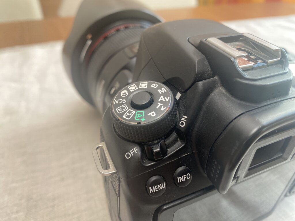
The first choice to make is the focal length or lens you use. A smaller number like 24mm means more of the table will be in frame, a higher number like 80mm means you’re more zoomed in and might have to step back further to get the same amount of table in frame. There are also effects called “compression” and “lens distortion”. When framing exactly the same area, very wide lenses (like 24mm and lower) can make straight lines appear bent where very narrow lenses (like 80mm and higher) do some funky stuff how distance between your subject and the background is perceived. It gets even more complicated depending on whether your camera has a crop (APSC) sensor or full frame sensor because a 24mm on an APSC sensor is like a 35mm on a full frame sensor. 35mm is roughly equivalent to what human’s see as their field of view. It’s all rather complicated.
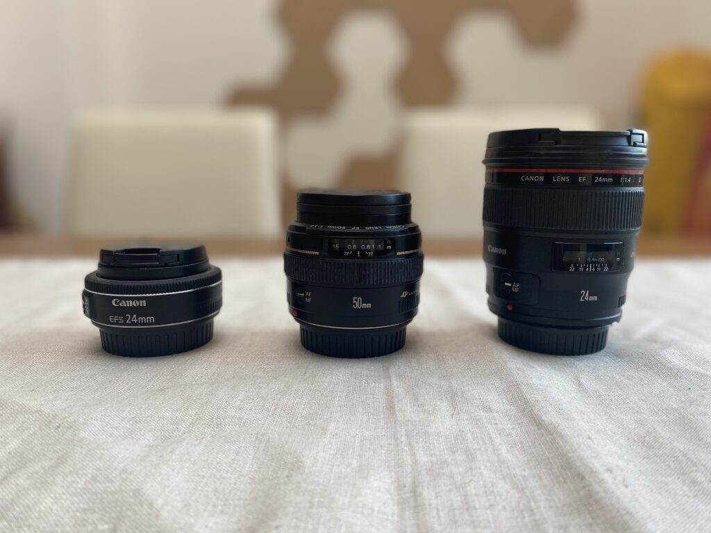
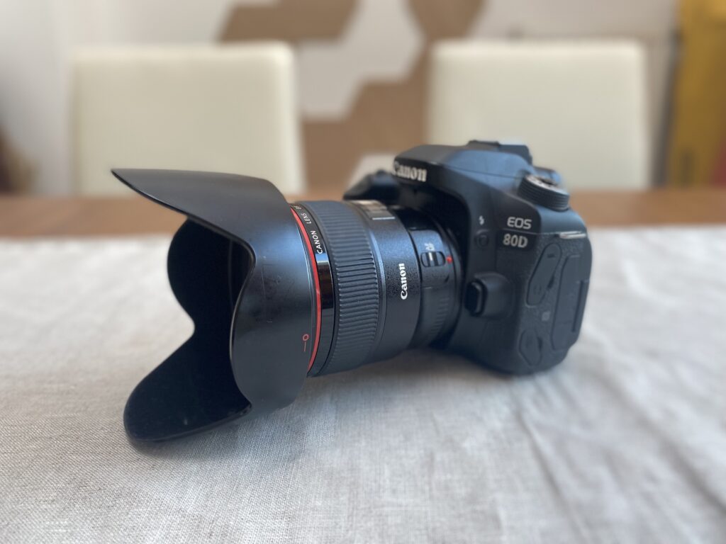
The camera I use (Canon 80D) has a crop sensor and I shoot almost everything with a 24mm “prime lens”. The last part is important, it means the lens has NO zoom at all but in general the image quality of prime lenses is better than that of zoom lenses (less layers of glass the light has to travel to). If you’re wondering why your DSLR with that lens that came in the box (a.k.a. the “kit lens”) doesn’t take amazing pictures, it’s that they gave you a cheap zoom lens. When I got my first prime, a 50mm f1.4, suddenly people started asking me if I could take pictures of them! It’s that much of a difference to be able to shoot below f4.0 and/or with a good quality lens.
Even for the same focal length and narrowing it down to primes, lenses can come in different grades of quality. I have a cheap 24mm f2.8 pancake (=tiny & cheap) lens and a heavy-duty, weather sealed 24mm f1.4 L (the Canon term for top of the line) lens. Since I got it, I pretty much do everything with the latter, but to be honest, if everything is lit well and for the application of board game photography, the difference between the two is not as big as you might think.
Before I had those, I shot with a 50mm f1.4 which has a slightly different look (which is really nice as well) but the biggest practical difference is you have to put more distance between you and the table to get everything in frame. The 24mm is simply more handy.
Tip 7: Use a prime lens, not a zoom lens. After lighting, having a good lens is probably the most important factor for image quality. The camera body itself is way less important than you might think. Also make sure the lens works at a close distance (not all lenses can focus that close).
Aperture and Depth of Field
You might have noticed the “f1.4”, “f2.8” above. That’s the maximum (the lowest numerical value, don’t ask) aperture the respective lens can shoot in. Again oversimplified: lower value equates to more light comes into the lens (=better pictures in poorly lit situations) but also more distance blur. Higher value equates to more things are in-focus sharp but more light is needed.
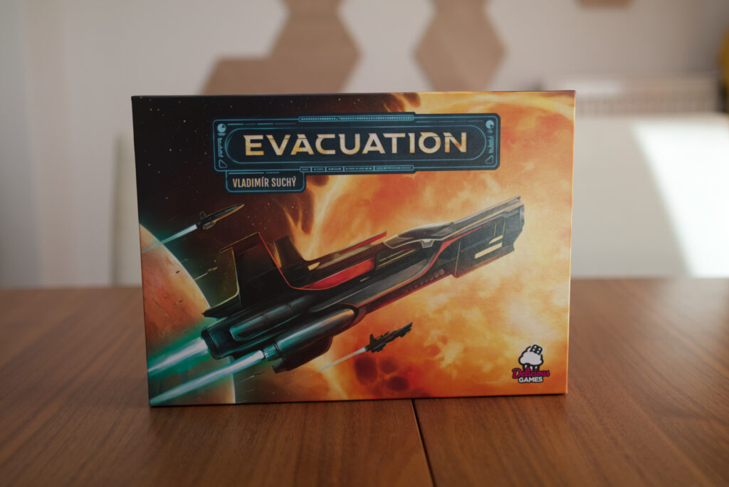
The following image of Evacuation was shot with the 24mm f1.4 lens at an aperture of f1.8. That produces a super shallow depth of field. At that distance, everything that’s a couple of cm further away from the box cover (even the back of the box) would be out of focus and slightly blurry. It’s only about a meter between the box and the back wall and it’s already super washed out. I think I shot f1.8 instead of f1.4 so I had a reasonably chance at least the whole cover is sharp! Seriously, at that f-stop, if you focus on someone’s nose their eyes are already a bit blurred.
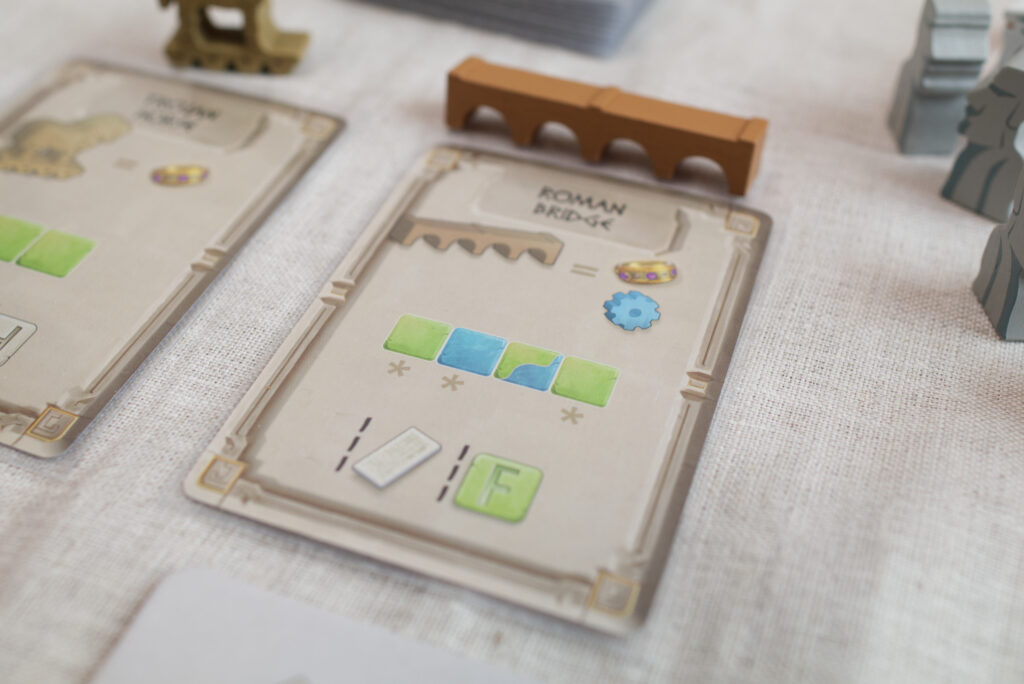
The closer you get to a subject, the worse things get. Here is an image of standard size card from World Wonders at f4.0 with an 24mm lens. The focus point was set on the middle of the card and the label on top of it is already not sharp. Heck, even the drawing of the bridge is no longer sharp. On the card to the left, the text is not even legible anymore.
By turning the aperture to a higher value, you get a bigger portion that stays sharp but the camera needs more light. The other reason to not go super high like f8.0 or so is that a slight blur helps put things into the background that are unimportant and focus the viewer on those parts that are in focus.
Tip 8: For 24mm, use f4.0 as a good starting point and go up if necessary. You want blur for separating foreground from background. But don’t overdo it. Thinks should still be legible. This is usually difficult to see on the back of your camera. Take a picture and zoom into it while viewing to check if everything is reasonably sharp. Don’t use f1.4 just because your lens can do it.
Ideally, you want all important things sharp and all unimportant things slightly blurry. That’s tricky do achieve. If I want the whole table surface sharp, physics don’t allow the wall that’s just behind it to be blurry. So if you see a beautiful blurry shot, it’s usually because someone put a huge amount of distance between the subject and the background relative to the camera and the subject (e.g. camera is a meter away from subject but background is 5 meter away). That’s one of the things that’s sub-optimal in my setup: the back wall is way too close to the table. Ideally there would be at least one or two more meters of space between the table and the wall.
Getting Correct Exposure
Now that everything is framed up right and you dialled in just the right amount of blur to put important things into focus, it’s time set the brightness of the image. We don’t want to loose details either in the highlights or in the shadows, but also the general overall brightness should match the mood of the room. Most DSLRs come with various priority modes, like aperture priority which keeps the aperture fixed to what the user specified and adjusts the shutter speed to create a good exposure. When I photograph outside, that’s what I use. I want to decide the amount of blur but leave it to the camera to make sure my shaky hands aren’t a problem and the images end up not too bright.
Priority (even more so auto-) modes however are a huge problem for photographing board games. The camera doesn’t know what is being photographed and just assumes it should raise the exposure level so everything on average is a nice medium value of brightness. So if you point it to a dark board in aperture priority mode, it will increase the ISO or lower the shutter speed to let more light in. If you then point it to the bright table cloth, it will lower the ISO or increase the shutter speed to let less light in. Same light setup, same room, different exposures.
Tip 9: Put the camera in full-manual mode! We need consistent images between shots and independent of what is in frame. It’s easier to dial settings in correctly once than having to adjust every photo differently during editing.
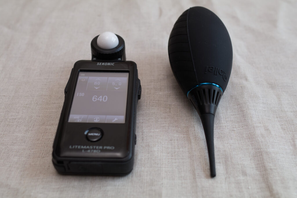
What I have started doing lately is lock in the aperture to f4.0 (for a mild amount of background blur) and the shutter speed to 1/60sec (anything lower and your images get blurry just based on your hands always shaking slightly). I then use the ISO value to adjust for a correct exposure without blown out highlights or shadows without details. Ideally, you have an external light meter for this but you can just take a few test shots and eyeball it. Most cameras have either a histogram function or highlight warnings (sometimes called “zebras” because the camera will put stripes into areas that are over-exposed) which you can use to make sure the display on the back of the camera isn’t tricking you and the image is actually properly exposed.
Going the Extra Mile: Exposing for the Background
If you have multiple light sources, e.g. a light like my wall panels in the background and another for the foreground, you might want to work slightly differently. Turn off the foreground light source and setup your camera to properly expose for the background. Only then turn on the foreground light and adjust its intensity to properly light the subject. This is what I have done in the following shot of Dune Imperium:
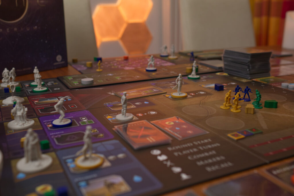
Compared to the other images on this page, you will notice that the background lights are way more intense. That is because I exposed for the background and reduced the insensitive of the foreground light (e.g. the Aputure 100d). In the other images, I didn’t care about the background light so I just cranked up the foreground light to full power so the camera can use a lower ISO value and produce less noise.
White Balance
So you’ve got the lighting, framing, the correct exposure, but there is still one more thing: white balance. Again, cameras come with a multitude of presets like “daylight” or “cloudy”. The whole topic of why a camera needs white balance is rather complex and has to do with how humans perceive colours (=relative) as opposed to how cameras do it (=absolute). For example, if you’re in snowy mountains, your eyes tell you the snow is pure white, but your camera’s sensor will say “hey, there is a lot of blue here” because the white snow will reflect the clear blue sky. Anyway, it’s all complicated.
Again, the important part for shooting boardgames is to stay consistent!
Tip 10: Don’t use auto-white balance. Instead, use one of the presets that best matches your light source. Or use the “Kelvin” setting and dial in a value so the images you take match what you are seeing with your eyes.
Whitebalance can be easily adjusted during editing, especially when shooting in RAW format (and not JPEGs). However, that takes time. I found it much easier to setup my camera correctly and not have to do editing later on. Using the Aputure 100d, which is calibrated for daylight, I just use the daylight preset on my camera and the images come out with sufficiently accurate colours. They are not perfect, but good enough.
Editing & Exporting
Typical editing steps are straightening out rotated images, cropping, adjusting exposure and white balance. All of these can be avoided by properly setting up your camera or framing your shot. If you do need to edit, locking the camera down into manual mode at least means you can edit one image and apply the same editing operations to all images.
Tip 11: Try to avoid the need for editing by doing as much as you can correctly in-camera. It saves a ton of time. If you are consistently doing more than just cropping and straightening, reconsider your process.
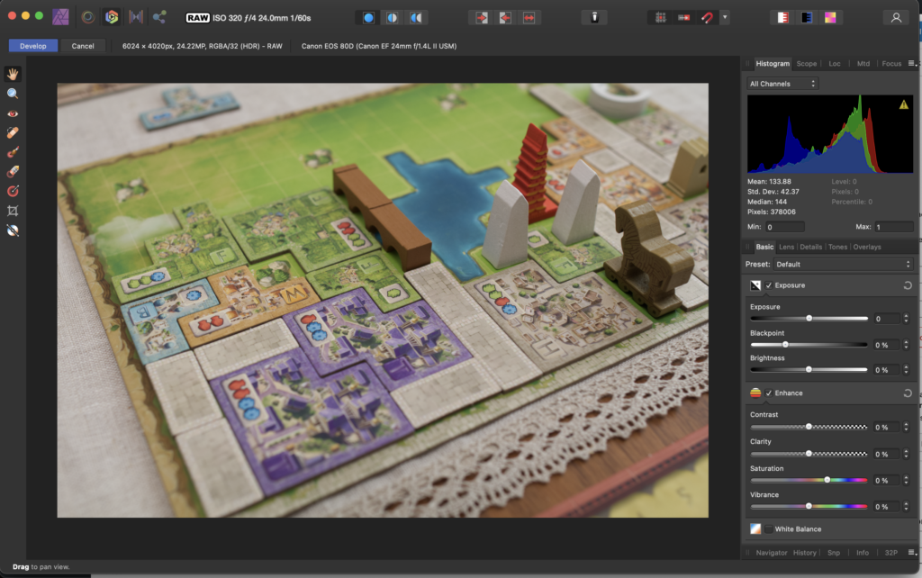
The following is an example of how the RAW image straight from the camera looks now that I’ve optimised my workflows. The exposure is good, colour look realistic, and the software has autocorrected for any distortion or vignetting the 24mm lens has created. Note also that the brightest parts of the image are not pure white (the histogram actually has a lot of room on the right). That is because I metered for the whole room independent on what is in frame. The table cloth is actually that colour and brightness.
I use Affinity Photo for editing but pretty much anything will suffice as long as it can correct for lens distortions (which every lens has). For serious shooting I would use Adobe Lightroom because it also allows for organising of photos, but for uninteresting reasons I have a different workflow now.
What I sometimes do if I’m too lazy to get everything out of frame is that I use Affinity Photo to remove like cables or shadows that snuck into frame and I find distracting. Or I crop the image to leave out things that only partially stick in-frame. When I crop, I always keep the original aspect ratio, unless I need a square for Instagram of course.
I shoot everything in RAW format (allows for exposure correction if I didn’t get everything right in-camera) and the Canon 80D produce 24 megapixel images. So as final step, I reduce everything to 2048 pixel in the vertical and export as a 90% compressed JPEG for smaller file size. And that’s it. That’s pretty much all I do.
Instant Feedback: Shooting Tethered
One of the things that’s the fastest way to improve your shooting is to have quick feedback cycles. Usually the screen on the back of a camera is a) too tiny and b) not colour/brightness accurate enough to really make creative decisions. So if I want to create really high quality images, I attach an HDMI cable to my camera, plug that cable into an Elgatoo CamLink 4K and stream the camera output to my MacBook Pro (I open QuickTime Pro and select “New Screen Recording). The same could also be done with a computer display or TV by directly going HDMI to the display. Modern cameras also allow to pair them with an iPad via Wifi. Whatever solution you use, you want a big screen to see your image. That way when you take an image, you immediately see what works and what not and can evaluate for example the amount of blur, etc.
Tip 12: Look at your images on a large screen. The back of your camera is not a good place to really evaluate the quality of an image. Ideally, you want to be able to shoot, take a quick look on a bigger screen, and correct what you are doing.
Gear List
Finally, here is the list of gear I use:
- Canon 80D DSLR with lens Canon 24mm f1.4L (occasionally Canon 50mm f1.4). My older & even cheaper Canon 550D (=Rebel T2i) body would have also been fine, I just upgraded to the 80D for video shooting purposes.
- Aputure 100d with the shipped-in-box cone adapter (occasionally with Aputure Light Dome II or Aputure Lantern as light modifiers)
- Manfrotto 055XPROB tripod I misuse as a light stand by screwing a small attachment on top that the light can hook in. I didn’t want to have unnecessary gear in my apartment so I didn’t buy a dedicated heavy duty light stand.
- The table is an extendable dining table from BoConcept, a 15 year old model that no longer exists and therefore was cheap to buy used. The wood is a dark walnut veneer.
- Nanoleaf Wood wall LED panels. As an alternative some other lights or candles would have worked nicely as background light accents.
- Litemaster Pro L-478D light meter for measuring correct exposures without guessing. This is a recent addition. It’s not really needed but speeds up the process.
- Rollei Tornado air blower to get dust off the lens, works better than cleaning cloths.
- Affinity Photo (for editing and developing from RAW to JPEG)
- Elgatoo CamLink 4k and mini HDMI-2-HDMI adapter for tethering to my laptop (I only use it if I really care about the quality of the images)
Note that the majority of my equipment I picked up used on the second hand market. Since most people have moved on to mirrorless cameras like the Sony Alphas, older DSLR bodies and respective lenses have dramatically dropped in prices. I also haven’t moved up to full-frame sensors like a Canon 5D mark II because with this type of controlled environment, I don’t really need it.
To reiterate: invest in a good light first, a prime lens second, and then worry about the camera body. Even if you want to stick with your iPhone, a good light will help tremendously.
Further Reading
I hope you enjoyed reading this and there was something new and helpful for you in this. If so, please let me know in the comments. It took quite some time to create this.
Finally, here are a couple of YouTube sources I recommend for everything photography in case you want to further deep dive on any of the topics:
- Lighting: Tyler Stalman has some great videos on lighting. I really like his style and sense of taste when it comes to that. I sympathise with him because he – same as me – has to tear down and set up his lighting setup every time.
- Product photography: Peter McKinnon is just plain fun to watch, period. But he also has some interesting videos on product photography hidden in there. For example he likes to go to thrift stores to pick up props for his compositions, uses incense candles for smoke effects, etc.
- Gear: Gerald Undone is great to watch reviews on lights and other camera gear like teleprompters, slider, etc.
- Cameras & Lenses: DPreview was the premier site for camera and lens tests for a long, long time. So if you are planning to buy older, used gear, it’s still really helpful. Unfortunately, they got bought and then the two main guys left. They are now working as PetaPixel.