So Antiquity from Joris & Jeroen (a.k.a. Splotter Spellen) is an amazing game. But it comes included with a free mini game I like to call “how many bowls can you find in your apartment?”. There are so many bits and bops to get out and put on the table that it made me wonder: how much faster would setup be with a nicely designed insert?
Since I recently got a 3D printer, I first did a quick search and only found inserts that were basically collections of rectangular boxes and neither seemed very functional nor aesthetically pleasing to me. So I gave it a shot to try to design my own insert and as always I’m now here to share what I learned as well as the actual files to print it if you chose to do so. Be warned, this is a big print!
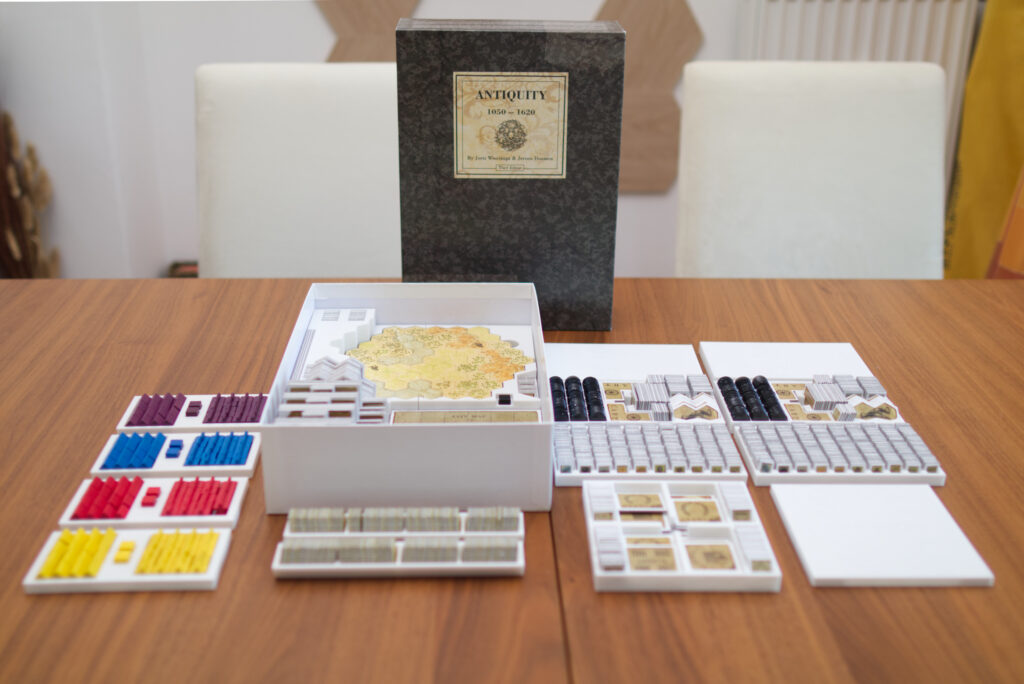
Designing It
As always, I started out in Blender3D as that’s the 3D tool I know best and broke out my callipers. The first step is to create a new scene and set it up for working in millimetres:
- Switch world units to mm and unit scale to 0.001
- Adjust grid scale to 0.001
- Adjust camera clip start / end to 1mm and 10000mm
Then I measured the inner volume of the box and added a cube of its size by using the “dimension” fields in the info panel. Inside it, I added another cube for the rules and player aids so I knew how much volume I had left to work with for puzzling in all the pieces. For both objects, I turned off “selectable” and switched them to “Display as Wire” so I won’t accidentally select them when working in the viewport and instead just have them as guidelines. And here comes the first lesson learned: for booklets, press them firmly when measuring or otherwise there will be a lot of slack in the box when you close it. I did this wrong initially and then had to basically re-size and re-print most of the parts when it finally noticed it.
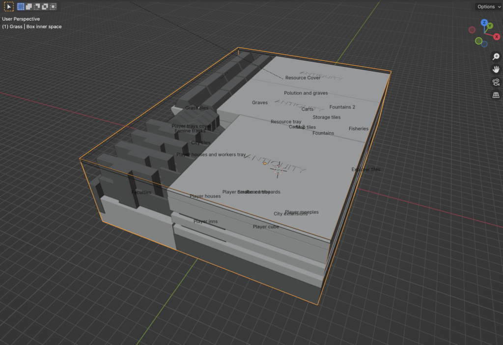
Which might be a good point to take a quick break and put down some design goals:
- Functional: I wanted the insert to be functional and cut down on setup time. That meant there should be as few trays as possible to get out when setting up the game. E.g. all resources should be in one tray, everything a player needs should ideally be in one tray, etc.
- 2-player optimised: I often play Antiquity with only two players and then I don’t want to have unnecessary stuff on the table. So you’ll notice that there are two trays for grass tiles, two for resources, two for pollution, etc. This way half of the content can stay in the box.
- Usability: it should be able to retrieve and insert pieces. This one would become tricky for the tiny resource pieces as we’ll see later.
- Vertical storage: I wanted everything to interlock so I could store the game vertically. The final test was to pack everything up, turn the box upside down, give it a shake, and then see if everything was still in place.
- Bottom insert part: From the get go, I planned for parts of the insert to remain in the box with trays on top of it. It both seemed practical plus I like the look of it.
- Beautiful: I wanted to add at least some flourish. In the end I did it way less than I had initially planned, but the project took a long time already, so maybe something for a v2.
- Printable: Pieces should be printable with no or only minimal support structures needed. And it of course had to fit the small-ish 18x18x18cm print volume of my Prusa Mini+.
With that out of the way, let’s start the 3D-tetrising!
Where to Start?
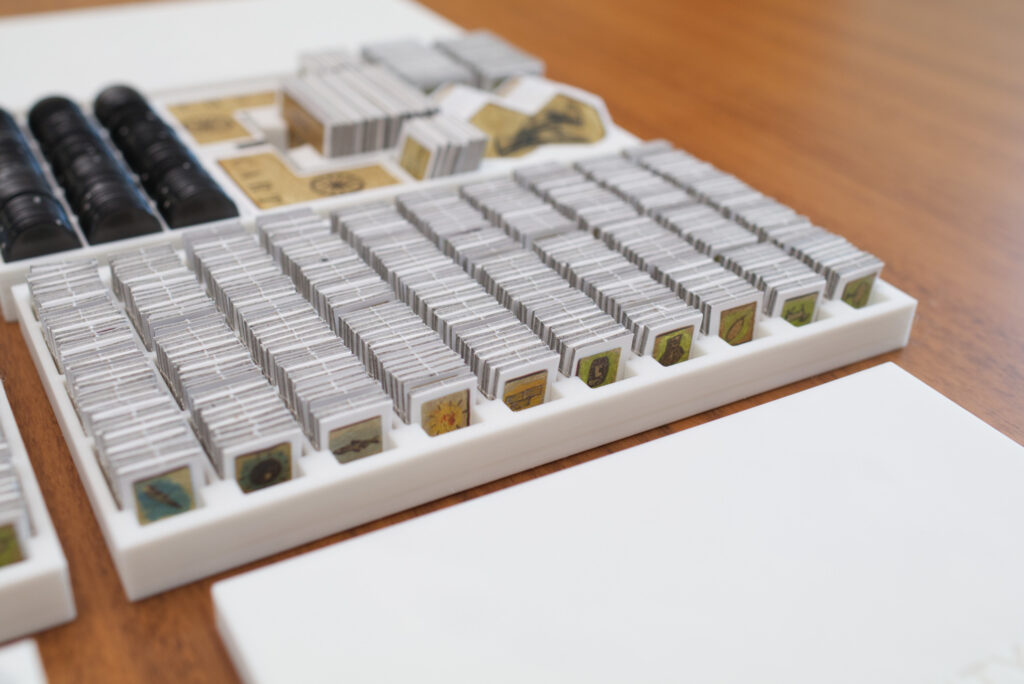
I started off with designing the resource tray as that would contain the most components (Antiquity comes with ~700 tiny cardboard resource counters!) and it also would have the biggest utility for me even if the rest of the insert wouldn’t be finished. I first designed it as two trays that hold all tokens of 5 types of resources each. But it didn’t take long for me to notice that that didn’t make sense at all. So I changed the split and made it two trays with each half of the resource tokens for all 10 types. That also gave me the idea for optimising for 2p setup.
I counted how many resources there are per type and measured them in packs of ten. This also was a lesson learned the hard way: don’t just measure one and extrapolate. Cardboard is flexible in some ways and tokens bend in other ways, so the physical reality of putting multiple counters together might not provide the same dimensions as the mathematical ideal. I thought it might be nice to have stacks of 10 pieces and since it didn’t work out completely, there is a small block with a few less counters added to the back. I then added an “Array” modifier to turn a single block into 3 high and 10 wide.
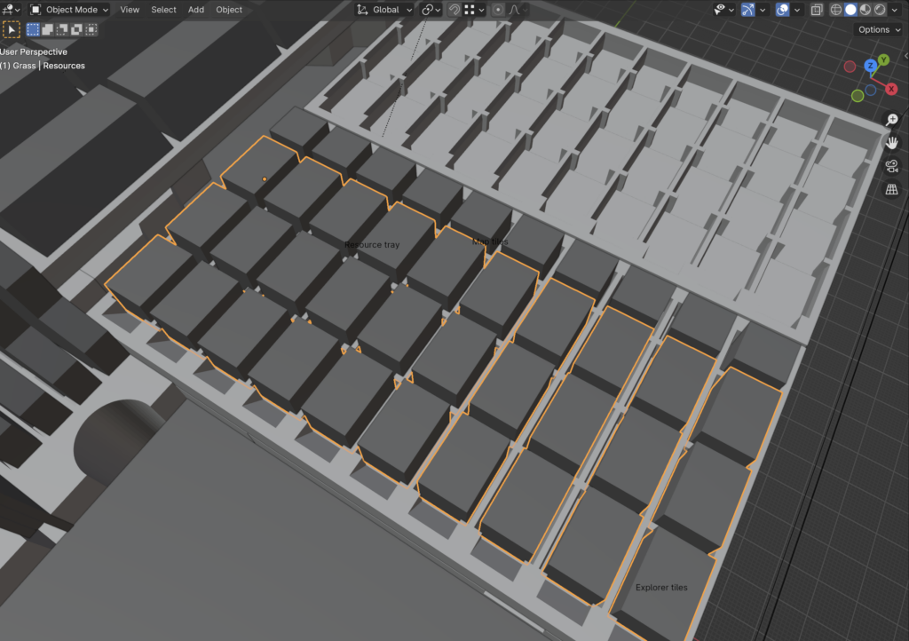
Then it was a case of simply drawing a cube around it that fit everything and deciding how high it should be. I settled for roughly half so the pieces would stay in the tray but could be easily pulled out. To actually create the cut out, I added a “Displace” modifier on my counters with 1.5 strength and then a Boolean operator on the tray itself to subtract the space for the counters. The 1.5 adds a bit of allowance to both make it easier to insert the counters and leave room for manufacturing tolerances.
Note: For this to work right, all scaling needs to be applied to the displaced object as the displacement strength is affected by scaling! If you have a scaling on the object of 10, the displacement will suddenly be 10x as much!
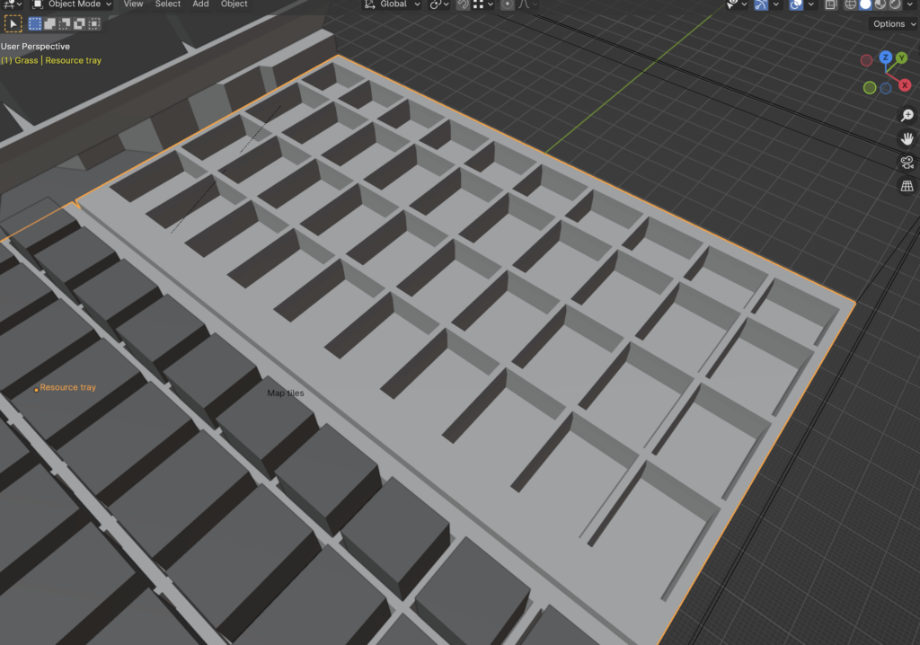
Just subtracting the counters doesn’t produce a very useable tray. So I added a groove and also a small ramp in the front. The latter is there to make the token image readable even when the tray is completely full. Once I printed it, it looked pretty good but it was tricky to get counters back into the tray. I would try to put one in and it would wedge itself firmly at an angle on the separator edges between different columns. So I changed the cut out shape and actually made it go a little bit outward towards the top. This created a sort of guiding lip. In the printed object, one hardly can see it, but it does wonders!
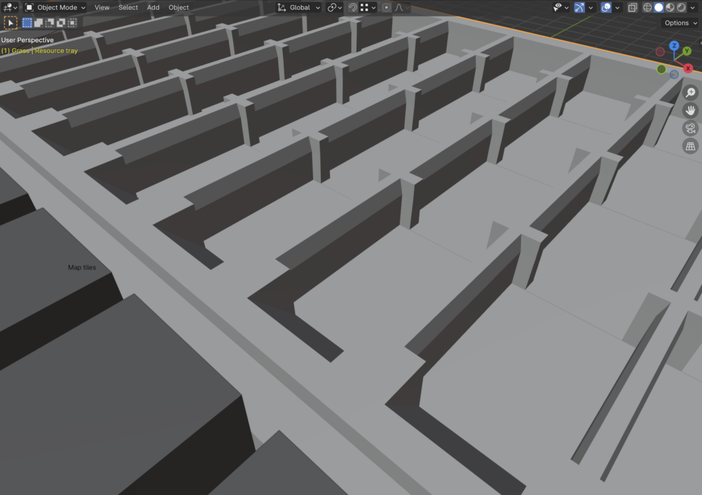
And with that, I had a nice resource tray that felt good to use and stored everything very compactly. It might seem simple when reading this, but in reality this took me multiple iterations and prints over 3-4 weeks to get it just right.
Tip: Another lesson learned is to avoid printing full parts during the design phase! 3D printing takes forever and you’ll be wasting a lot of material. For the resource trays for example, I ended up using a Boolean “intersect” operator to cut out one slice of one resource type so the printable object would be just about a cm in width. That printed much faster! Printing a 4h piece just to notice you got some tolerance wrong by half a millimeter really isn’t fun …
Getting It All to Fit
I then started thinking about how I can fit in all the components into the box. I knew I would place the large map tiles and city expansion flat on the bottom of the box and somewhere to the sides to maximise the remaining available space. That led me to this basic arrangement:
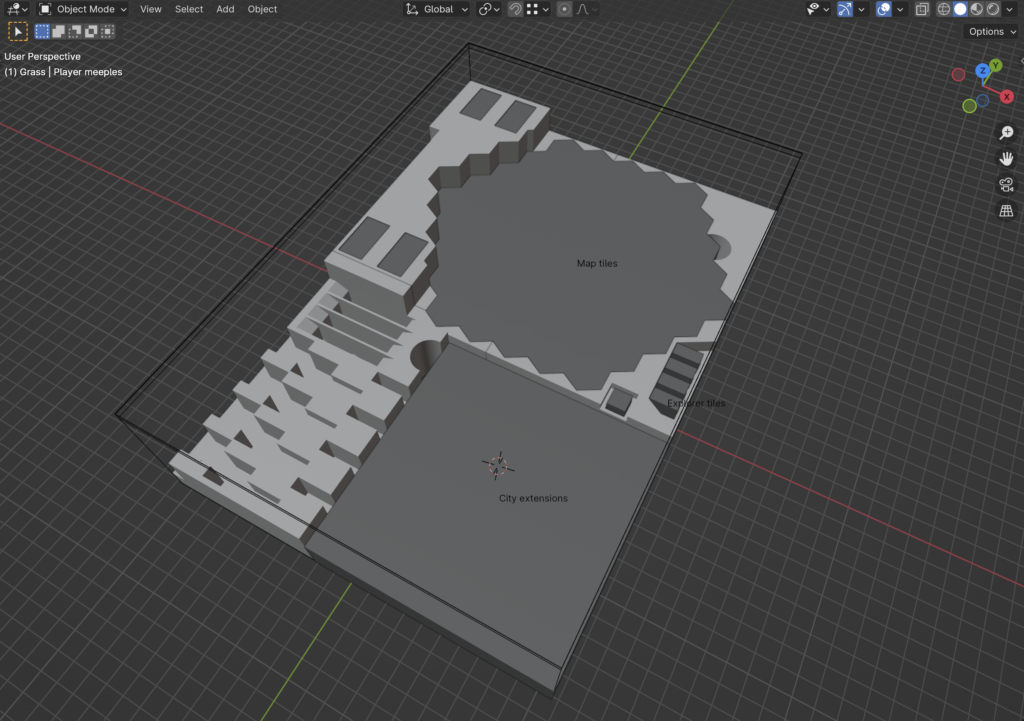
I then started cutting out parts to make space for additional game content. For example, on the right side are the explorer tokens which I arranged in four stacks of one of each type. This is again to optimise for 2p setup because this way I can just take out two stacks and know I have the correct distribution of farm goods I need for setup.
You’ll also notice that the explorer tiles and the famine cube are “sunken in”. I did this intentionally all over this insert to make a component’s top flush with the next layer of trays. This way I could stack some tray on top and things would automatically be locked in. This worked out quite well overall and allows for the vertical box storage without needing many covers or latches. It took me a number of tries though to develop a sensibility how much negative space must be added around the tokens so they are still easy to get out.
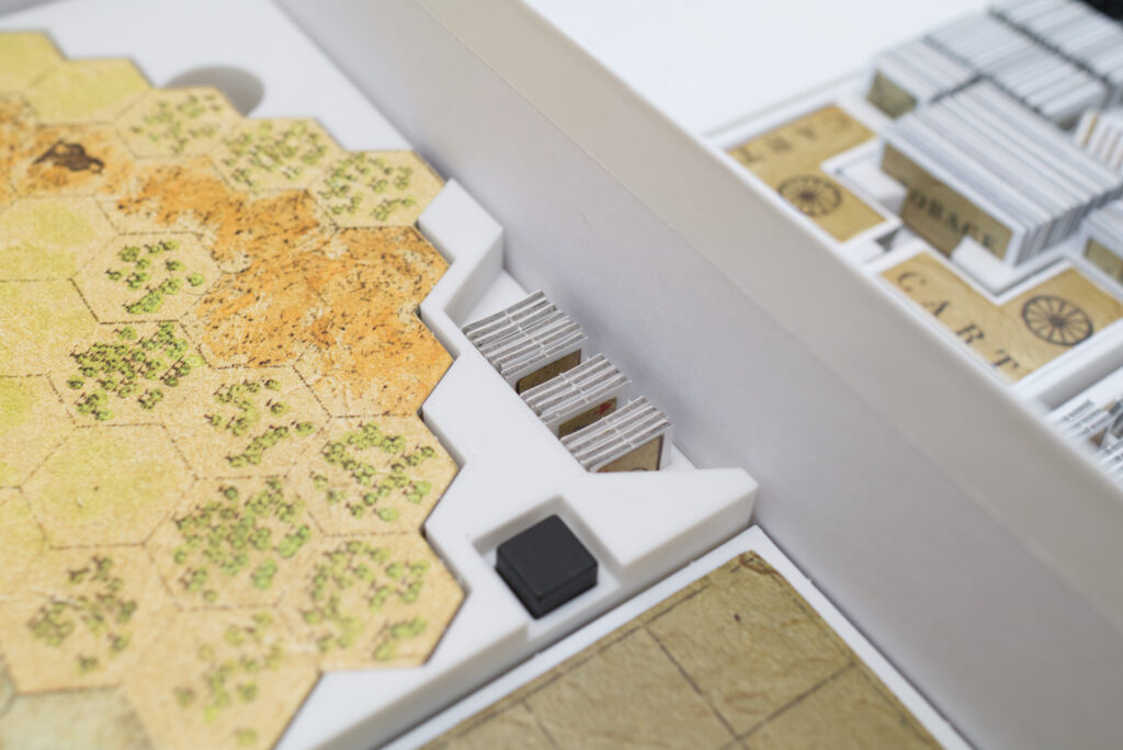
Speaking of easy to get out, I also rather late added finger cut outs in some strategic places. Those are basically 2-3cm diameter cylinders that are again cut out with Boolean operators.
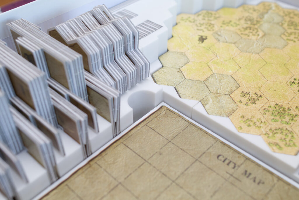
With the big parts out of the way, I realised that the resource trays would pretty much cover the footprint of the map tiles and I needed to find a place where to store all the player pieces, especially the large cardboard buildings and cities. It took some puzzling but in the end I decided the only thing that really would work was to put those vertically and put the wooden player pieces and cardboard houses into separate trays. So I arranged, measured, and modelled the pieces (which took a long time to get right) and then again – you guessed it – used Boolean operators to cut those out.
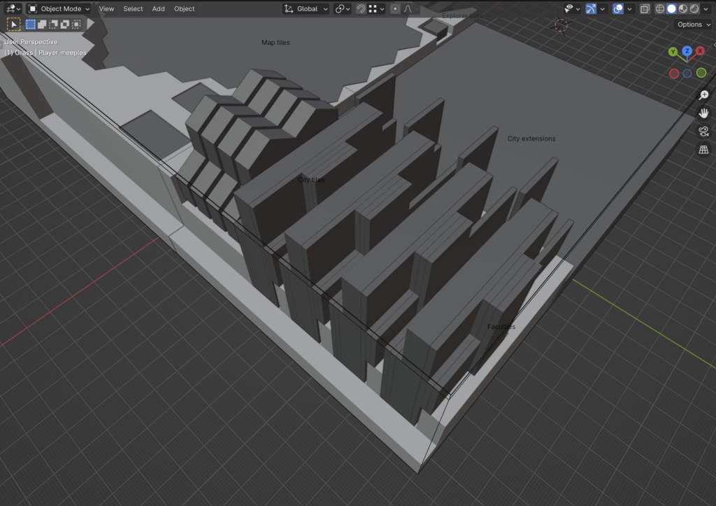
Boolean Operators
So let me take a small detour and talk about Boolean operators for a minute. Since I’m basically working a lot with negative space here, being able to “subtract” things is key. However, mathematically, this is a quite fragile operation and I ran into issue with Blender’s Boolean operators multiple times. So here are a few general rules:
- Make sure the meshes you use are clean! Like no self-intersection, no duplicate vertices or faces, etc.
- Don’t try to cut exact face-on-face stuff. What I mean is if you have a cube and want to cut another cube out of it from the top, avoid that the top faces of both cubes are perfectly aligned along the Z-axis. It works much better if the piece you are cutting out with is a tiny bit bigger as the Boolean operation doesn’t have to concern itself with mathematical edge cases.
- Add displace operators: 3D printer are not 100% precise and modelling something as 12mm won’t produce a print that’s exactly 12mm. Also a perfect fit is usually too tight for practical use. So I got into the habit of adding a 1.5 displace operator on my cut out objects and that seemed to work really well. As mentioned before: keep in mind to check that scale is 1.0 for those objects and if not, “apply scale” to make it so!
- If all things fail and the Boolean operation produces garbage (often happens when cutting multiple shapes out of one object), try changing the order of operators. If that doesn’t work, activate the “self-intersection” option in the properties of the Boolean operator. Note: if your measures are clean and without garbage in them, this usually shouldn’t be needed.
- Parent the “cut out object” to the object you are cutting from. This can be done by shift-dragging the object onto the target object in the outlier tree view. If you don’t do this, moving the main object will change your shape because the cut out stays in the same place!
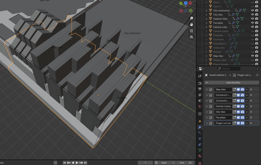
Trays, Trays, Trays
By now, I had the basic technique down and things progressed faster. I created the player component trays and a shared tray for the houses and smaller cardboard buildings. I don’t like that last part, but there didn’t seem to be another solution that would still fit. For the player trays themselves, they are still a bit to bulky for my taste but I had to use up the whole volume in the box for things to inter-lock properly. Probably something to revisit for a v2.
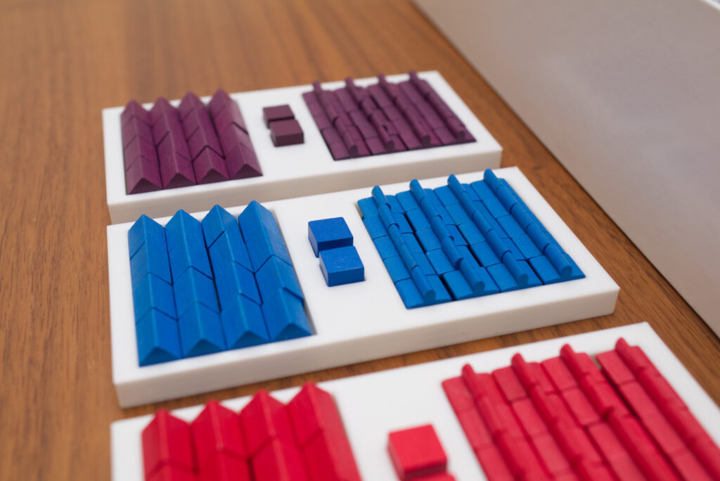
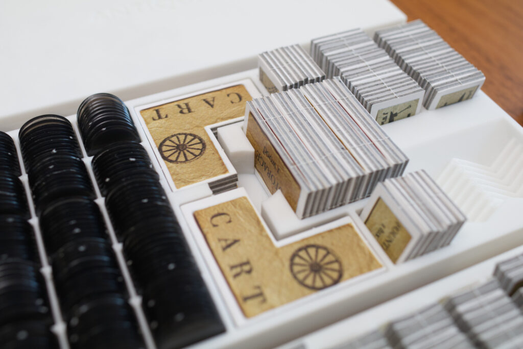
I initially had designed independent small trays for storage, carts, fisheries, etc. but noticed that that made things unnecessarily complicated. By squeezing all of those onto a single tray (or rather two identical ones), setup got much faster and the insert shapes simpler. Since the fisheries were quite large, I had to develop a new trick where I rotated objects 45 degrees and then used the array operator again to fan them out. This turned out well but caused some issues with the Boolean operators due to self intersections. In the end, I decided to apply the array operator permanently, fix the vertices manually, and then had once again a clean mesh to cut out.
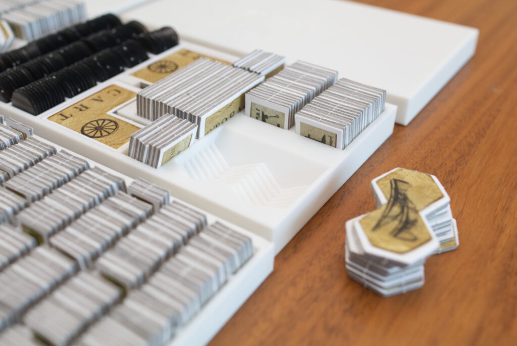
Again, I’m going through this like it would have worked on the first try. It didn’t! I think I printed each tray at least twice, sometimes up to four times before getting it right. Sometimes I hadn’t measured accurately enough and there was too much wiggle room, sometimes things didn’t quite fit all or were hard to get out.
Details, Details
In the end, there are tons of little details that turned the basic shapes into something that’s really useable. Like some small ridges under the player meeples to prevent them from sliding around, cut outs here and there, half a millimetre additions or subtractions, …
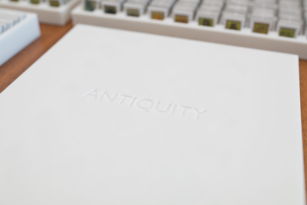
One fun addition I probably should have added more of was the use of embossing. I used it mainly for labelling by again cutting out shapes out of the main shapes, this time though only for a millimetre or so. If I ever find time to revisit this insert, I’d probably add some nice graphics on all the tray covers that are mainly only there so things don’t fall out when stored vertically. The Antiquity text helped to break up the monotonous surface, but I think there is room for a little bit more flourish.
Printing Tips
First of all: this insert is tightly fitted for the Third Edition of Antiquity. It won’t work for earlier editions as token sizes changed and it won’t fit the GeekUp bits as they are much thicker. Sorry!
Otherwise it’s pretty easy to print. It’s designed for a standard 0.4mm nozzle and I used some generic Anycubic White PLA. I used Input Shaping on Structural with 0.2mm layer height which turned out fine and I didn’t feel the need for smaller layers. If that doesn’t mean anything to you, Input Shaping is a new-ish technique to speed up prints and “structural” is Pursa’s name for the quality-optimised settings instead of speed-optimised settings.
I split the main box insert into four parts during the modelling process and added bolts that can be jammed into side-holes to connect everything. It’s crude but seems to work. Most pieces don’t need support though I activated it for the large insert pieces that go at the bottom of the box because that produced nicer connector holes. For the tray covers, I flipped them 180 degrees and printed them with the logo towards the print bed.
I also recommend to reduce infill! I did some tests and even 5% infill (gyroid) seem to work fine for me, which reduces both the used material and print time substantially.
Warning: As always, check your printed parts for sharp areas or printing blobs before inserting your game components! Especially the cardboard pieces can easily scratch if there is a sharp printing artifact sticking out. I got into the habit of going around each surface with my finger whenever I had printed a new piece and used a diamond file to get rid of imperfections.
Here is a list for print time and cost:
- Insert top right: 1h 19m, 22g, 0.55€
- Insert top left: 3h 32m, 76g, ~1.92€
- Insert middle right: 1h 17m, 24g, ~0.60€
- Insert bottom left: 4h 29m, 88g, ~2.24€
- Grass tray: 1h 8m, 24g, ~0.60€ (x2)
- Resource tray: 2h 36m, 55g, ~1.39 (x2)
- Pollution & shared cardboard tray: 2h 56m, 59g, 1.49€ (x2)
- Resource tray cover: 2h 9m, 50g, ~1.27€ (x2)
- Player tray cardboard components: 2h 58m, 66g, ~1.67
- Player tray cover: 2h 54m, 60g, ~1.53€
- Player tray wooden components: 1h 13m, 28g, ~0.71€ (x4)
- Connector bolt: 1m, 0.13g, ~0.01€ (x3)
So all in all print time is 40+ hours and cost 20-25€ depending on the price of your filament. By the way, I also had a smart plug attached to the printer and I was surprised that the power consumption is quite negligible. I don’t have precise numbers just for this project, but I would guess about 0.50€.
So as you can see, this turned out to be quite a costly project. I can’t even say how many hours I put into 3D modelling, tweaking, printing prototypes, re-iterating. If I have to guess, I would say it’s north of 100 hours spent in Blender for the modelling alone.
I learned a lot, but I don’t think I’ll be designing any other inserts soon. It takes a lot of time and there are few games where it’s really worth it as much as for Antiquity. It kind of hit a sweet spot: it’s an amazing game I’m definitely going to keep and an insert cuts down setup costs quite tremendously. I could imagine doing one for Horseless Carriage at some point, but not any time soon!
Packing Guide
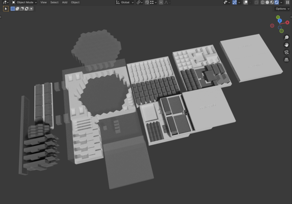
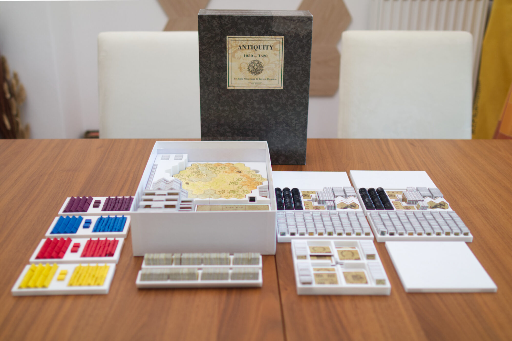
And here a quick instruction on how to assemble everything: Use the three connector pins to assemble the four larger pieces for the bottom part that stays in the box (the large white element in the screenshot below. Insert it into the box and the place the map tiles and city extensions in the large gaps. Insert the cardboard ins in the four slots in the top left (which are flush because you won’t ever need to take them out) and the famine cube and explorer tokens in the small slots on the right. In the bottom left, place the cities vertically into the slots and the larger buildings into the bottom left corner. This involves a little bit of puzzling but should be easy to figure out.
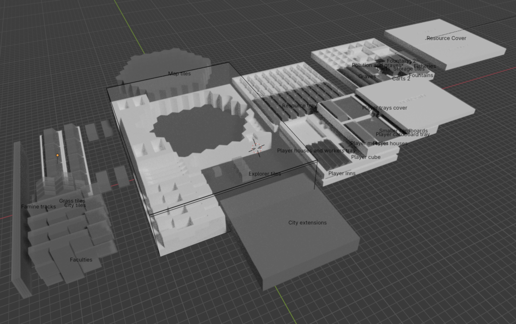
Fill the two resources trays with the cardboard tokens and place them on top of the map tiles. Place the pollution discs and shared buildings (farms, fishery, graves, fountains) in the other trays and place them on top of the resource trays. To finish that stack off, put a resource cover on each one.
In the lower right corner, place the player piece trays as 2 stacks of 2 trays. On top of that place the large tray with all the generic player stuff like the houses and smaller buildings and once again finish everything off with the cover.
Slot the famine tracks into the leftmost indent, add the grass tiles to the hex-shaped trays and places those on top of where the cardboard ins are, resting on the city tiles and larger buildings.
STL Files & License
Here are the files for download. Please note the license file in the ZIP. You’re free to print for personal use, leave a comment if you do so. However, you’re prohibited from uploading them on other sides like thingiverse, printable, etc or put the stuff in your Etsy shop! This was a fun pet project for me and I’m happy to share the results with the community. But it would be disappointing if someone takes it and tries to profit from it in whatever form. So don’t spoil the fun for me!
- Antiquity Insert.zip – 0.1 MB (v1, last updated Jun 29, 2024)
Disclaimer: Use at own risk! In particular, check for print artifacts such as blobs or sharp edges that might damage your game components. For more information, check license file. All copyright regarding Antiquity itself of course belongs to Splotter Spellen.
I liked reading about the design considerations for this project. Particularly the advice to measure a stack of tiles rather than 1 and multiplying, as well as the suggestion to press booklets flat. Such advice might save me a lot of time in designing my own organisers.
On an organiser for Horseless Carriage, I bought one at the same time as ordering the game. Any game where the cardboard weight is measured in kilograms benefits from one. Being able to set up in five to ten minutes makes the game much more likely to be played.
Something I don’t often see with inserts are fillets and fillet radii (bevelling in Blender, also my preferred software). They add structural strength as well as the rounded edges making taking and replacing pieces easier. I appreciate this adds hours more work.
Have you used geometry nodes to help design any of your organisers?
I was actually thinking about adding some fillets if I would do another iteration! However, I would assume that makes printing more complicated. Like a nice rounded bevel would require support to be added if it’s at the bottom, which increases print time and always leaves surface marks when removing it. I ran into similar issues when I wanted to cut out parts from the underside of trays so they interlock better (just took tons of support material to print). What could work would be adding 45 degree angles instead of round bevels because that can print without supports. So basically chopping off the hard edges and corners.
Geometry nodes: no, it’s mostly cubes that have other elements subtracted from them. The only except were the city and map tiles. I created a geometry node to turn one hex into city (7-hex) or map tile, so basically a more complex array modifier. Unfortunately, there doesn’t seem to be a good way to remove internal geometry with geometry nodes and using the geometry node output for boolean operations caused too many problems. I had to apply the geometry node, take the resulting object and then clean it up manually.
Hi, this is such a great insert! I’m printing it out now and the precision is remarkable. Hands down one of (if not the) best 3D printed inserts I’ve printed. I am wondering how a lot of it fits though. I can see some spots here and there from the images provided however I’m still struggling on “where exactly everything goes”, lol. Are you able to post some more pics on how it all fits layer by layer with each set of pieces? Thanks in advance and once again well designed!
Thanks so much for the feedback. A lot of time and love has gone into this one, so much appreciated.
I added another overview image and a short description, hope that helps. Have lots of fun with Antiquity!
Just got a 3d printer and this is first on the list to print as it looks amazing. Thank you for the work you put in and thank you for making this available!
Thanks for leaving feedback. Have lots of fun printing and playing antiquity. And make sure to check your parts for blobs of plastic or other sharp artifacts that might scratch your game components. I usually run over everything with my fingers or check nooks with a file.